Justin Carter's madfellas.com

Blog redesign, Twittering, OS X and more...

About a week or so ago I gave my blog another redesign :D This time I've gone a bit more minimalist by using just a couple of gradients and some old-school pixelated design elements for the logo and edge of the content area. In my search for an image to go in the header I thought of using the CF logo somehow but didn't quite know what to put with it; then I stumbled on Kai Koenig's "coolest CF t-shirt ever" photo on Flickr featuring the (slightly modified) CF dude from the AIR Launch Party poster by eboy. <boratVoice>Great success!</boratVoice>

Next, I've begun using Twitter on a regular basis now and you can see my last few messages on the madfellas home page or follow me if you're also using Twitter. I'll mostly be twittering about CF and tech related topics with the usual funny web stuff thrown in. At the moment I'm using the TweetDeck client and I'm finding it quite good.

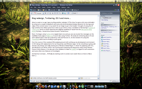
Over the course of the weekend I'll be playing around with setting up my development environment in OS X along with replacements for my frequently used Windows apps. So far everything is going well and the only things I am really missing are a Windows Media Player 11 which I'm replacing with VLC, and Windows Live Writer which I am running (and composing this blog entry with) using VMware Fusion's Unity feature :)


os-x-live-writer


I've also got a few updates to make to ColdExt in regard to user extensions and some other new features to investigate.

And last but not least... I'll finally be starting work in London next week! More on that to follow later ;)

Ext JS 3.0 Designer tool... Whoa!

Jack Slocum has shared some sneak peak screencasts of the new Designer tool in Ext JS 3.0, and all I have to say is: coooool! It's a slick looking AIR app (built with Ext JS obviously) which lets you drag and drop UI components and data stores onto a canvas to design your UI with no real coding at all. Jack says that it is a tool that he would use himself which speaks volumes for how powerful a tool it will be.

Check it out for yourself :)

Watch the Ext JS 3.0 Designer preview

Weekend Coding Riffs - Issue #1

I love coding while listening to music. Not only does it help block out unwanted background noise - like phones ringing, people typing loudly or the bad jokes of the office clown (just kidding, those things don't bother me so much) - a good guitar riff and some heavy drumming puts me "in the zone" for coding.

(Weird observation: I've frequently had the experience where I've been listening to music at work and paused a track to get up and go to lunch, and upon returning 45 minutes later I've pressed play and the resumption of the song has put me straight back into "the zone"; almost like I didn't have a break in concentration. Weird but cool!)

So I thought I'd start sharing some of the music I like, in a series of "Weekend Coding Riffs" postings. There are a couple of good music services around which let you share songs or playlists online, such as Deezer (my favourite at the moment, supports playlist) and Songza (good for individual songs). I know there are other services like Pandora but these days it's unfortunately restricted to the US only. If you know of any others that work well then let me know ;)

I had a few great songs in mind today from upcoming Australian artists but some are really quite difficult to find online. Instead, I've just picked a couple of songs with similarly themed names, from two of my favourite Aussie bands. Without further ado...

Cog - No Other Way

Via last.fm/music/Cog:

"Organic in the sense that Cog play their instruments, some people would say Cog’s music resembles some sort of progressive rock that flows effortlessly from thick slabs of distorted guitars, twisting rhythms through to vast playgrounds of ambient organospace and back again. Not shy to incorporate sequencing and sampling to propagate more ideas in a live and recording environment, Cog feels this has opened the possibilities for more musical exploration."

This is the opening track from Cog's latest release. This song has an amazing climax and is just a taste of the power they deliver in the other tracks.


Discover Cog!


If you're a fan of any progressive rock / metal you need to listen to the whole album! :)

Karnivool - The Only Way (cover)

Via last.fm/music/Karnivool:

"Karnivool is a five-piece music group from Perth, Australia. Their music style is a combination of melodic progressive rock and alternative rock, with alternative metal influences. Major influences of the band are Nirvana, Meshuggah and Carcass. Capturing a perfect blend of both melodic beauty and heavy, spine-bending rock, Karnivool will appeal to anyone who desires a truly unique sound."

This song is cover of an original song by Gotye, but the Karnivool guys do it amazing justice. I've seen them play this song live and my spine was tingling the whole time, so turn it up loud!

Jump on over to their MySpace page to check out some of their original songs. (In fact, the version of The Only Way on their MySpace page is much better quality, but I don't think it's possible to embed them, bah!).


I hope someone finds these tracks interesting, and maybe in a fortnight I'll whip up another post. (Definitely not next weekend though, because I'm moving to London ;) Haha...)

Focus on the window at hand: Shroudy

I've been sitting on this idea for several months and thought I would throw it out there to see if it has any merit. It has to do with workflow and focusing on your current task or, more precisely, focusing on the window(s) you are currently working in.

The idea was prompted by a post that I read on Rob Rohan's blog about WriteRoom and JDarkRoom, both of which are very minimalist, full-screen text editors somewhat reminiscent of the good old monochrome days (hah) which are simply sporting some coloured text on a black background and not much else (visibly speaking). The idea behind it is that you can focus on what you are writing without any distractions; no flashing chat windows, notifications, or other adjacent windows catching your eye.

So what happens if you want to achieve this ideal when you're working with any other applications and not just a text editor? The solution for some people is to maximise the window and be done with it, but personally I only ever maximise a select few applications (e.g. Outlook, Photoshop, Excel) because they actually demand a lot of screen real estate. Most applications I use, particularly for development work, are windowed and arranged in a way that I can quickly and easily switch between them with a single click and without going all the way down to the taskbar with the mouse.


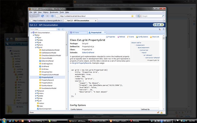
My idea is to go with the trend of what we've already seen happening in user interfaces in the last few years, ala Lightbox, Windows Vista's Secure Desktop, and Expose on OS X (it's subtle, but it's there). We could use a dark overlay or "shroud" to mask the unused areas of the screen, allowing us to focus more clearly on the application that we are using at that moment.

Focus on the window at hand: Shroudy


In the screenshot you may notice an AIR application in the taskbar called "Shroudy", which is also the name I used in the title of this post. Don't get too excited because it is indeed a truly "dumb" application that would never work in the real world (as an AIR app), because it has no built-in "smarts" and can't get access to the OS level stuff that it would need. But what it did was let me get an idea of how it would feel to work with a shroud covering the parts of the screen I wasn't interested in at that point in time, and I have to say I think it was nice. It also got me thinking about other usability aspects which I think I have answers for...

So how would an application like Shroudy work in the real world?

  • It would be an opaque window covering the entire screen
  • It would not appear as a running program in the taskbar, it would have an icon in the notification area
  • It would have an option to enable or disable covering the taskbar, or to disable covering the taskbar when the mouse hovers over it
  • It would have a configurable opacity level, and a configurable dynamic opacity level which could change when the mouse cursor is outside the bounds of the active window (it could get lighter for better visibility, then after some timeout go back to it's original value)
  • It would not display the "shroud" if there are no applications open
  • It would be activated or deactivated by holding the Windows key for 3 seconds (configurable)
  • It would listen for window activation messages and place itself directly below the active window in the z-order
  • It would not capture any clicks directly, but instead pass them to the window(s) behind it (a click on the desktop would deactivate it)
  • It would support multiple windows being "on-top" of the shroud, either by Control-clicking on windows ("Control-clicking through the shroud"), or even holding the Control key while the mouse cursor is over an inactive window, to bring it above the shroud while keeping the other active window(s) above the shroud
  • It would support pinning applications "always on-top" of the shroud, by selecting them in the context menu of the notification icon
  • Similarly, it would support being deactivated by default and only being active when using some certain applications, by selecting them in the context menu of the notification icon
  • It would support multiple desktops with a configuration open to choose either a common shroud across all desktops, independent shroud on each desktop, or being enabled on some desktops and not others
  • Similarly, it would support multiple virtual desktops, to support the use of applications such as DeskSpace or any native virtual desktop implementations (Windows 7, please!)

Unfortunately I'm not a Windows developer so I can't make this kind of application become a reality (I haven't touched the Win32 API or our good friends hWnd, wParam and lParam in at least 6 years! And who knows what kind of obstacles Vista might have thrown in on top). Still, I'd be interested to know if anyone thinks something like this is a good idea (or if I'm just nuts), and more interested still if someone thinks they could actually pull it off :)

And if someone does it on OS X or Linux first I'll be annoyed; maybe even annoyed enough to change operating systems! But probably not, hahaha...

Anyway, Shroudy is an application I'd like to have, or a feature I'd like my OS to have. What do you think?
Google Android + Street View + Compasss = Amazing!

I just saw this one over on Engadget... For the most part they walk through Gmail push features and some simple mapping stuff, but watch it from the 5 minute mark onwards - at about 5 minutes 55 seconds they show off a compass feature that will blow your mind!

Now I find myself imagining the day that we can use a GPS with driving directions that practically shows a video of your entire journey! Cool, scary, convenient? :)